


Table of Content
Summary
Understanding pitch deck fundamentals
A pitch deck is a visual presentation that combines storytelling, design, and data to convince investors to fund your startup within 10-20 minutes.
[01]
Master essential deck elements
Effective decks include problem statement, solution, market opportunity, business model, competitive analysis, team credentials, financial projections, and funding requirements.
[02]
Follow proven structural formulas
Most successful pitch decks contain 10-15 slides structured to guide investors through your business narrative logically, creating compelling momentum toward funding requests.
[03]
Implement best design practices
High-quality visuals, clear messaging, data-driven claims, and professional design communicate that you're serious about execution and worthy of investor capital.
[04]
Avoid preventable pitfalls
Common mistakes like unrealistic projections, weak team slides, poor design, and missing market validation significantly damage credibility with investors.
[05]
A pitch deck is a visual presentation that entrepreneurs and business leaders use to communicate their business idea, strategy, and financial projections to potential investors, partners, and stakeholders. It's a carefully crafted sequence of slides that tells the compelling story of your company, demonstrating why it deserves investment and support.
Pitch decks meaning in the startup context is straightforward: a founder's argument for capital, compressed into 10-20 minutes of slides.
After reviewing over 200 pitch decks across fintech, healthtech, SaaS, and consumer sectors, I've noticed a consistent pattern:
Founders spend roughly 80% of their preparation time perfecting slides 1-3 (title, problem, solution) and then rush through the financial projections that investors actually scrutinize most carefully.
Think of a pitch deck as a visual narrative that guides your audience through the key aspects of your business in a structured, persuasive manner. Unlike a lengthy business plan document, a pitch deck is concise, visually engaging, and designed to spark investor interest within a limited time frame, typically 10 to 20 minutes for in-person presentations.
The short answer is a pitch deck is a 10-15 slide document that entrepreneurs use to raise capital from investors, typically presented in a 20-minute meeting. It covers problem, solution, market size, business model, traction, team, and the funding ask.
What does pitch deck mean?
The meaning of 'pitch deck' refers to a structured visual presentation designed specifically for investor fundraising conversations, distinguishing it from general business presentations or sales decks.
In startup fundraising, pitch deck meaning is a capital-raising tool: a founder's first opportunity to demonstrate business judgement, market understanding, and execution credibility.
At its core, a pitch deck is your test.
Can you explain your business clearly?
Do you understand your market?
Investors are evaluating founder judgement, not slide design.


What makes a pitch deck essential?
Understanding pitch decks meaning goes beyond the slides themselves. The deck isn't about your product. It's about your investor's risk calculus.
According to Harvard Business Review research on investor behavior, investors receive hundreds of pitch requests yearly, so your deck is often your first and only chance to capture attention. A well-designed pitch deck can be the difference between a meeting and the delete folder.
Building a pitch deck forces rigor. You can't gloss over unit economics or customer acquisition on slides. A professional deck signals you've thought through the details and you're ready to execute.
You've got to articulate your market opportunity, competitive position, unit economics, and growth plan in a format that takes 20 minutes to present. Investors commit capital to founders who can do that clearly.
What essential elements drive pitch deck results?
Every pitch deck that closes a round, and pitch decks meaning in this context is exactly this, answers five critical questions.
What problem does it solve?
Who has this problem?
How acute is their pain?
Why does your solution uniquely win?
Can your team execute at scale?
And why must this happen now, not next year?
Founders who can answer all before investors ask tend to raise faster. That's the entire game. Everything else is just clarity and credibility.
Problem Statement: Start by identifying a real problem that your target market faces. Describe the problem in terms that resonate emotionally and logically with investors.
Quantify the problem when possible:
How many people are affected? What is the cost of this problem?
Your Solution: Explain how your product or service solves the identified problem.
Focus on unique features and benefits that differentiate your solution from alternatives.
Make it clear why your approach is superior to existing solutions.
Market Opportunity: Demonstrate the size and growth potential of your target market.
Include total addressable market (TAM), serviceable addressable market (SAM), and serviceable obtainable market (SOM) estimates.

Investors scrutinise these projections carefully across deal stages to understand the revenue potential of your business.
TAM: The total market size available to your solution
SAM: The portion of TAM your company can realistically reach
SOM: Your projected market share within a defined timeframe
Business Model: This is where 'pitch deck' meaning becomes operational.
Explain how your company generates revenue, including pricing strategy, customer acquisition costs, lifetime value metrics, and unit economics.
Don't be vague here. Investors need to see that you've thought through unit economics and a path to profitability. Vagueness on monetisation kills more pitches than bad product ideas.
Competitive Analysis: Identify your direct and indirect competitors and highlight your competitive advantages.
Explain why customers will choose your solution and be honest about competition while confidently presenting your differentiation.
When positioning your company, articulate not just what you do, but why what you do matters relative to alternatives investors already know about.
Go-to-Market Strategy: Outline how you'll acquire customers and achieve market penetration with clear marketing, sales strategy, and customer acquisition channels.
Show that you have a realistic plan to reach your target market.
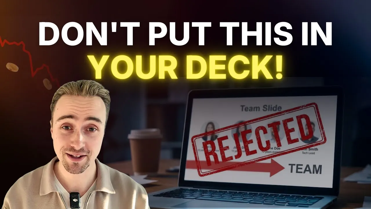
Team and Expertise: Introduce your founding team and key personnel.
Highlight relevant experience, past successes, and complementary skills. Investors invest in people first and ideas second, so prove your team can execute.
Financial Projections: Pitch deck meaning in investor terms often comes down to this slide. Present realistic revenue forecasts, expense projections, and profitability timelines with metrics like customer acquisition cost, lifetime value, and burn rate.
Investors scrutinise these numbers heavily, so make sure they align with industry benchmarks. Financials aren't just numbers; they're proof that you understand your business.
The best pitch decks present ambitious vision paired with conservative financial assumptions. This combination demonstrates both ambition and realistic planning.
Funding Requirements: Clearly state how much capital you're seeking and how you'll deploy it.
Break down your use of funds across categories like product development, marketing, hiring, and operations.
This transparency demonstrates financial responsibility and strategic thinking.
Recommended pitch deck structure for maximum impact
Most winning decks follow this sequence, and understanding pitch decks meaning helps explain why the order matters. Each slide builds on the last, answering investor questions in order. The structure forces discipline: you can't skip steps or fudge the story.
You've got to walk them from problem to solution to market size to your ask.
Slide # | Title | Content Focus |
|---|---|---|
1 | Title Slide | Company name, tagline, founder names, date |
2 | Problem | Market problem statement and pain points |
3 | Solution | Your product/service and solution details |
4 | Market Opportunity | TAM, SAM, SOM, and market size data |
5 | Business Model | Revenue streams and pricing strategy |
6 | Traction | Users, revenue, partnerships, milestones |
7 | Competition | Competitive landscape and differentiation |
8 | Go-to-Market | Customer acquisition and growth strategy |
9 | Team | Founding team bios and relevant experience |
10 | Financial Projections | 3-5 year revenue and expense forecasts |
11 | Funding Ask | Amount seeking and use of funds breakdown |
This structure, endorsed by a16z's pitching guidance and Sequoia Capital's business plan framework, works because it maps to investor decision-making. Each slide answers the questions investors ask in sequence. You can adjust the order based on your situation, but don't skip steps.
Slide-by-slide breakdown: what investors actually want to see?
Understanding what belongs on each slide separates fundable decks from the reject pile. Investors can sense when a founder has thought through each slide's purpose versus when they're just filling a template.
Slide 1: title slide, your opening statement
Your title slide introduces your company, tagline, founder names, and presentation date in a clean, memorable format. What investors look for: a clear company name and a one-sentence mission that describes what you do in plain English, not jargon.
Your tagline should be understandable to a smart person who knows nothing about your industry. Common mistake: founders bury their value proposition in corporate-speak, but the title slide is your only chance to make a first impression, so invest in professional design here.
Slide 2: Problem – make investors feel the pain
The problem slide is where you establish conviction. What investors look for:
Quantified pain points that resonate emotionally
Show how many people face this problem
What it costs them in time, money, or suffering.
Name a specific persona affected by the problem, not a vague one that could apply to anyone. "Communication is broken" is not a problem; "Enterprise customer success teams spend an average of 15 hours per week on manual status updates" is a problem that investors respect.
Slide 3: Solution – position yourself as the obvious answer
Now show how your product eliminates the specific pain you just described. What investors look for:
Clarity about your unique approach
Why it works better than existing alternatives, with a demo screenshot or product image.
Don't oversell, and avoid solutions that could apply to five different problems. The strongest solution slides show a tight connection between the problem (slide 2) and your product (slide 3), with specific examples like: "We built a SaaS platform that automatically generates status updates from Slack messages, reducing manual overhead to zero."
Slide 4: Market opportunity – prove the prize is worth fighting for
This slide quantifies your addressable market using TAM, SAM, and SOM. What investors look for: realistic, bottom-up market sizing backed by real data, not extrapolated from an inflated TAM.
Investors scrutinise this slide heavily because it's where founders most often overestimate.
Common mistake: claiming a TAM of $100 billion without justifying it or showing your work.
SAM should be defensible (the market you can realistically reach with your go-to-market strategy) and SOM should be conservative (your first-year target). A TAM/SAM/SOM slide that shows disciplined thinking demonstrates founder judgement.
Slide 5: Business model – prove you understand the unit economics
How do you make money? What investors look for:
A clear revenue model with pricing and customer acquisition strategy baked in.
If you're B2B SaaS, show annual contract value (ACV), customer acquisition cost (CAC), and lifetime value (LTV).
The magic number: LTV should be at least 3x your CAC for healthy unit economics. Common mistake: vague revenue models ("We'll figure out monetisation later") or unrealistic pricing assumptions that don't hold up under scrutiny.
Slide 6: Traction shows that reality backs your story
This is where you prove the market actually wants what you've built. What investors look for:
Concrete evidence of product-market fit signals through users, customers, revenue, partnerships with recognisable names, press mentions, or pilot results.
Even for early-stage startups, show something: beta signups, letters of intent, organic growth, or partnerships.
Common mistake: assuming you have no traction worth mentioning, but honest traction beats misleading claims every time.
"We have 10 paying customers with $5K MRR" is stronger than "We have 1,000 signups" if the signups are unvalidated. Investors want to see that real people want what you're building, not just that you're good at marketing.


Slide 7: competitive landscape, acknowledge reality and own it
Who else is trying to solve this problem, and why do you win? What investors look for:
Honest competitive positioning that shows you understand the market.
Name your actual competitors
Explain your advantage, and be clear about whether you're faster, cheaper, more specific, or better designed.
Avoid claiming you have no competitors; that signals naivety. Instead, acknowledge the 800-pound gorilla and explain why the incumbent doesn't own your specific segment or why you can displace them with a focused approach.
Slide 8: Go-to-market strategy – prove you know how to acquire customers
How will you reach and convert your target customer? What investors look for:
A realistic customer acquisition plan with specific channels and economics, showing monthly or annual targets and cost-per-acquisition with concrete numbers.
Common mistake: go-to-market strategies that are vague or generic. "We'll do inbound marketing and strategic partnerships" is not a strategy; it's a wish list.
"We'll acquire early-stage founders through Product Hunt launches and Y Combinator founder networks, targeting a 10% conversion rate at $500 CAC" is a strategy because it's specific and has unit economics attached. This slide separates founders who understand their acquisition funnel from those who are guessing.
Slide 9: Team, prove you can execute
Who are the founders and key team members, and why are they the right people for this job? What investors look for: relevant experience, complementary skills, and evidence of past execution.
Show what each founder has built or achieved before this company.
Common mistake: weak team presentations that don't highlight the credentials that matter.
Investors invest in people first and ideas second, so prove your team can execute with relevant past wins, domain expertise, and complementary capabilities that signal execution strength.
Slide 10: Financial projections – prove you understand your business unit economics
Show revenue, expense, and profitability projections for the next 3-5 years. What investors look for:
Realistic financial models that align with comparable companies and your stated unit economics, with key metrics like MRR, CAC, LTV, and burn rate.
Common mistake: financial projections that don't align with your market sizing or traction. If you claim 1,000 customers by year 2 but your market slide suggested a TAM of only 500, you've lost credibility immediately.
Ensure your financials are internally consistent and conservative, with modeled scenarios (base, upside, downside) that show how you'll reach profitability.
Slide 11: The ask – be specific about what you want
How much capital are you raising, and exactly how will you deploy it? What investors look for:
A clear funding target and a realistic use-of-funds breakdown.
Common breakdowns: product development (30%), marketing and sales (40%), team and operations (25%), and contingency (5%).
Common mistake: asking for a vague amount or providing an unclear use-of-funds breakdown. "We're raising $2M to accelerate customer acquisition and double developer capacity" is specific; "We're raising to fund growth" is vague.
Slide 12 (optional): Why now? explain the urgency
Why must this problem be solved in 2026 and not 2024 or 2028? What investors look for:
External market forces that create urgency and tailwinds for your solution through regulatory changes, technology breakthroughs, or shifting customer behaviors.
Common mistake: only 25% of decks include this slide, which is a huge gap. If your problem has been around for a decade, why should investors believe now is the moment?
The strongest "why now" slides point to external forces: "AI has made real-time personalisation viable for small e-commerce businesses" or "European privacy regulations created new compliance demand. " A "why now" slide demonstrates you're riding market tailwinds, not fighting headwinds.

What investors actually look at first?
Most founders misunderstand how investors evaluate pitch decks in real time. During the first pass, investors spend roughly 30 seconds scanning your deck before deciding whether to dig deeper. In that window, three things matter: team credibility, market size, and evidence of traction.
Slides 3-5 (solution, market opportunity, and business model) receive the most scrutiny during deeper review because they reveal whether you understand your unit economics and can execute. The cover slide, despite being your opening, is almost never the deciding factor; it serves mainly as a reference point investors use to recall your company later.
The financial projections slide is where founder credibility lives or dies. Investors can sense immediately whether your numbers are internally consistent and grounded in real customer acquisition math or if they're disconnected from your stated traction and go-to-market strategy.
What are the best practices for creating effective pitch decks?
Follow the 5-bullet maximum rule. Never put more than 5 bullet points on a single slide.
If you have 6 or more ideas to communicate, split the slide into two or delete the weakest points.
Every slide should be understood in 5-10 seconds while you're talking, which means text-heavy slides and complex graphics kill your message before you've opened your mouth.
Apply the one-key-insight-per-slide rule. Each slide should make exactly one core point.
If slide 4 (market opportunity) is making points about both TAM and your competitive advantage, split it into two slides or move the advantage to the competition slide.
Investors lose focus on slides that pile multiple ideas into one visual; clarity requires discipline about what each slide's single job is.
Apply bottom-up methodology to financial projections.
Never project revenue by estimating market share; instead, model how many customers you'll acquire each month, what you'll charge them, and what your churn rate will be. Top-down market share assumptions ($100B TAM times 2% penetration) kill credibility faster than any design flaw.
Show the math: if you're acquiring 10 customers per month at $500 CAC, growing to 50 per month by month 12, and your LTV is $2,000, your year-one revenue projects to $120,000. That credibility matters far more than slick design; a beautifully designed deck with weak financial logic loses to an utilitarian deck with transparent, defensible unit economics.
Every design choice should serve one of five purposes: problem clarity, solution credibility, market validation, team capability, or financial realism. Delete any design element that doesn't serve these purposes, and avoid animations, gradients, or custom illustrations that distract from your message.
Support claims with data. Back every claim with credible sources.
When you claim a market opportunity or growth projection, provide evidence.
Investors spot unsourced claims immediately. Use TechCrunch's startup coverage and Y Combinator's startup library for benchmarks. Be transparent about assumptions.
Customize for your audience. Tailor your pitch deck for different audiences.
A pitch to venture capitalists may emphasize growth potential, while a pitch to corporate partners might focus on strategic fit.
Research your audience and adjust your content accordingly. For deeper insights on investor expectations, explore our guide on investor due diligence checklist in pitch presentations.
Practice your presentation. Rehearse your pitch multiple times to ensure smooth delivery.
Time yourself to fit within the allocated time frame.
Practice handling questions and pivoting based on audience interests. Preparation builds confidence and improves your presentation quality.
Balance text and visuals carefully. Aim for a 70/30 ratio favoring visuals over text.
Use images, charts, and infographics to communicate information, ensuring your message lands clearly with investors.
Key points should be readable in 5-10 seconds, allowing investors to quickly grasp your message.
Include social proof strategically. Add customer logos, partnerships with recognisable companies, press mentions, or traction metrics.
Most winning decks include 3-5 pieces of social proof that investors recognize.
A testimonial from your mom doesn't count. A pilot with a Fortune 500 company does. Don't scatter social proof randomly across the deck.
Concentrate it on the slides where it matters: traction, team, and competitive positioning. When reviewing pitch deck examples from successful companies, pay special attention to where they've positioned their customer logos and partnership logos for maximum impact.
Design mistakes that kill pitch decks
Beyond these best practices, avoid specific design failures that sink otherwise solid decks. Inconsistent fonts and colors signal sloppiness and lack of attention to detail. Choose two fonts maximum (one for headers, one for body) and stick to a color palette of 3-4 primary colors plus neutrals.
Pixelated or low-quality images scream that you didn't invest time in your presentation. Use high-resolution photos and illustrations. Clutter on slides is the enemy of clarity.
If a slide has more than 5 bullet points or feels crowded, delete half the content. Animations and transitions should be nonexistent or extremely minimal. Every fade, slide, or spin distracts from your message.
Overuse of charts and graphs can confuse rather than clarify. Use visuals to make a single point, not to display complexity. If you need a chart, make it large, simple, and labelled clearly.
What common mistakes damage pitch deck credibility?
Most rejected decks fail for the same reasons. 'Pitch decks' meaning shifts when founders conflate polish with substance. After reviewing 200+ decks across fintech, healthtech, SaaS, and consumer, I've identified nine patterns that kill investor response rates.
Mistake 1: Unrealistic growth projections
Unrealistic growth projections top the list. Founders claim 300% year-over-year growth without justifying how they'll acquire customers at that rate. This kills credibility immediately.
Use conservative estimates based on real market analysis, not wishful thinking.
Show your customer acquisition math: if you're acquiring customers at $500 CAC and your LTV is $2,500, and you have 50 current customers, your year-two target should reflect realistic increases in sales capacity, not fantasy.
Investors have seen thousands of decks and pattern-match away from unrealistic projections in seconds.
Mistake 2: Insufficient market validation
Founders claim product-market fit without showing evidence. You need proof that real people want what you've built:
Paying customers
Signed letters of intent
Beta user retention data, or organic inbound demand.
"We have 5,000 newsletter signups" is not the same as "We have 50 paying customers."
Investors want to see traction that costs something to acquire (customers) or demonstrates genuine interest (pilot programs with named companies). Without this, your deck is theoretical.
Mistake 3: Weak team presentation
Founders minimize the team slide thinking the product speaks for itself. It doesn't. Investors invest in people first and ideas second.
Your team slide must credibly demonstrate that you can execute at scale. If your founding team is two first-time founders with no relevant experience, acknowledge this honestly and show how you're addressing the gap (advisors, hires, past wins).
If your CEO has a track record of building companies, lead with that. The weakest team slides are ones where founders bury their credentials or use generic titles without context.
"VP of Sales with 10 years of SaaS experience" is stronger than "Chief Revenue Officer."
Mistake 4: Ignoring the competitive landscape
Claiming you have no competitors signals naivety or worse, that you haven't done your homework. There are always alternatives, whether they're direct competitors, indirect competitors, or the status quo (doing nothing or using a legacy tool). The strongest competitive slides acknowledge the major players and explain why you win in a specific segment.
"Salesforce dominates enterprise, but we're building for early-stage startups that need 80% of the features at 20% of the cost" is honest positioning.
Mistake 5: Poorly designed slides
Founders skimp on design thinking it's cosmetic. It's not. Quality design signals that you're serious.
Avoid cluttered layouts, inconsistent fonts, pixelated graphics, and low-quality imagery.
In our experience reviewing pitch decks at spectup, the vast majority of rejected decks have design working against the founder. You don't need custom illustrations or elaborate animations.
You need professional, consistent, clean layouts that let your message shine.
Use a simple color palette, readable fonts, and whitespace. If design isn't your strength, hire a designer for $500-2,000 to build a template you can iterate on.
Mistake 6: Missing the "why now?" slide
Only 25% of decks include a "why now?" slide explaining the market timing and urgency. This is a massive gap. If your problem has existed for ten years, why should investors believe this is the moment to solve it?
The strongest decks point to external forces creating tailwinds: regulatory changes, technology breakthroughs, or shifting customer behavior. "AI has made real-time personalization viable for small e-commerce businesses, which wasn't possible five years ago" explains why your timing is right. Skip this slide and investors question your conviction about market timing.
Mistake 7: Vague go-to-market strategy
40% of decks omit a go-to-market strategy or use empty buzzwords without data. "We'll do inbound marketing and strategic partnerships" is not a strategy. It's a wish list.
Your GTM slide should show:
Which specific customer channels will you pursue?
How you'll convert them?
What your unit economics are
What your customer acquisition targets are
"We'll acquire early-stage SaaS founders through ProductHunt, indie hacker communities, and Y Combinator networks, targeting a 10% conversion rate at $400 CAC" is a strategy because it's specific and has assumed unit economics attached.
Mistake 8: Text-heavy slides
Founders fill slides with dense paragraphs thinking more information is better. It's the opposite. Reading dense slides to investors is ineffective and signals weak narrative skills.
Follow the 70/30 rule: 70% visuals, 30% text.
Use bullet points for key claims, images and charts for data, and let your verbal presentation provide the story. If your slide can't be understood in 5-10 seconds while you're talking, you've lost the investor's attention.
Mistake 9: Missing financial details or inconsistent math
Vague unit economics or unclear use-of-funds breakdowns raise red flags. Be specific about how you'll deploy capital and ensure your financials are internally consistent. If your market slide shows a $10M SAM but your financial projections show $50M revenue by year three, the investor will notice the math doesn't work.
Stress-test your assumptions.
Show that you understand profitability pathways and what metrics matter.
Investors scrutinize financial slides heavily, so make sure they align with industry benchmarks and your stated unit economics.
Tailoring your deck for different scenarios
Different audiences want different things, and pitch deck meanings shift based on who's in the room. Angel investors care about founder credibility and market opportunity. VCs want scalability and unit economics.
Corporate partners care about strategic fit. Tailor the emphasis accordingly. When working with a fundraising consultant, you'll map your story to each audience type before you design.
Your pitch deck isn't a static document, it's a living tool that evolves as your business grows and market conditions change. Update it regularly with new traction, customer wins, and refined financial projections.
An elevator pitch deck has 5-7 slides. A demo day deck needs visual polish and a tight problem-solution-market narrative. A VC meeting deck can reach 15-20 slides.
Know your audience before you start designing. It shapes everything.
Tools and resources for success
You need three things to build a strong deck: design tools, data sources, and reference examples. The right tools matter. Professional design signals seriousness.
But tools don't fix weak storytelling.
Design platforms like Canva offer user-friendly templates with drag-and-drop functionality, making professional design accessible to non-designers.
Figma enables collaborative work for distributed teams, allowing real-time feedback on design iterations.
Adobe Creative Suite provides professional-grade design tools for custom, high-quality presentations.
Traditional PowerPoint and Google Slides remain effective options with extensive template libraries and investor familiarity.
Canva: Intuitive interface with pre-built pitch deck templates and brand kit functionality
Figma: Collaborative design tool ideal for remote team feedback and iteration cycles
Adobe Creative Suite: Professional-grade design for completely custom, high-polish presentations
PowerPoint/Google Slides: Traditional platforms with extensive templates and investor familiarity
Keynote: Mac-native alternative with polished default templates and smooth animations
Research and data sources matter for credible market sizing and benchmarking. Top VCs universally prioritize data transparency and honest problem acknowledgment over polish.
Statista: Comprehensive market statistics and industry-specific data
CB Insights: Startup trends and funding data with pattern analysis
PitchBook: Detailed VC funding data and deal terms
Gartner: Sector-specific research and market forecasts
Educational resources: Y Combinator, TechCrunch, and Index Ventures all publish extensive guides based on thousands of pitches and investor essays. Our comprehensive guide on how to structure a pitch deck walks through the complete creation process, and if you're looking to sharpen your narrative, pitch deck consulting professionals can help you understand what specific investor types prioritize.
What we know about pitch decks that actually raise capital?
Your pitch deck is your argument for capital. It distills your business vision into a narrative designed to convince investors. Whether you're a first-time founder or a seasoned operator, mastering this skill changes your outcomes.
The best pitch decks tell a clear story backed by data. They answer every investor question before it's asked. They demonstrate founder judgment, not just product polish.
Your pitch deck isn't static, and understanding pitch decks meaning means continuous refinement based on investor feedback. Update it with new traction and market signals.
Successful entrepreneurs see pitching as ongoing iteration, not a one-time event.
Pitch deck myths that waste founder time
I want to address three myths about pitch decks that I see founders fall into regularly.
Myth 1: "my deck needs to be visually stunning to win meetings."
False. I've seen founders spend $5,000 on a custom design agency and still get rejected because the fundamentals were weak. The best decks I've reviewed were simple, clean, and focused on clarity.
You don't need custom illustrations or elaborate motion graphics. You need slides that let your message shine. A $200 Canva template with solid content beats a $5,000 custom design with weak storylines.
Invest in narrative first, design second.
Myth 2: "I need to demonstrate $100M opportunity to raise a seed round."
Also false. Seed investors care about unit economics and team credibility more than TAM size. A founder who can credibly explain how they'll acquire 100 customers in year one at $500 CAC with a $2,500 LTV is more fundable than a founder claiming a $50B TAM with no customer acquisition strategy.
Realistic thinking beats inflated ambition every time. Be honest about your addressable market and focus on proving you can execute against it.
Myth 3: "My pitch deck needs to be 20+ slides to cover everything."
Wrong. The tightest, most fundable decks are 10-15 slides that tell a clear story without filler. Every slide should answer one question or make one point.
If you're adding slides just to fill space, you're weakening the deck, not strengthening it. I'd rather see 12 tight slides that build narrative momentum than 25 slides where founders lose investor attention by slide 8.
Y Combinator's pitch deck design guide provides useful benchmarks on what investors actually want to see, with real examples from successful companies that illustrate the principles we've covered.
My direct assessment: what separates fundable decks from the rest
After reviewing pitch decks for over 200 startups across fintech, healthtech, SaaS, and consumer businesses, the pattern is consistent. Fundable decks are not prettier, longer, or more detailed than rejected ones. They are more honest.
They acknowledge the hard parts, the competitive threat from the incumbent, the customer acquisition cost that isn't proved yet, and the team gap they need to fill. They address each one directly rather than hoping investors won't notice.
Investors notice, and they respect founders who demonstrate that awareness. A pitch deck that buries the "how do you acquire customers?" question in vague marketing language loses credibility with every sentence.
A pitch deck that says "our current CAC is $180, which is 2.4x our LTV at current pricing, and here's our six-month plan to fix that" earns a follow-up meeting because it proves the founder understands the business.
The bar has risen. A few years ago, a clean story and a large TAM got meetings. Today, investors see ten times more decks and pattern-match away from generic slides in seconds.
The decks that move have specific claims: named customers, concrete retention rates, and named competitors with clear differentiation. Specificity is credibility.
How spectup helps founders build pitch-ready decks?
Most founders who come to spectup have been rejected once or twice. The deck looks polished. The slides are clean.
But it doesn't move investors. The problem is almost always story architecture, market sizing, or unit economics that don't hold up under scrutiny.
We build decks around investor decision criteria, not founder enthusiasm. That means bottoms-up market sizing, stress-tested financials, and competitive positioning that says something real. Our pitch deck services cover story architecture through final design.
Across 200+ engagements, one pattern is consistent: founders who raise faster are the ones who answer the five questions before investors ask.
What's the problem?
Who has it?
Why do you win?
Can you execute?
Why now?
A deck that answers all five with evidence converts first meetings into second meetings. Learn more about our approach at spectup.
Concise Recap: Key Insights
Pitch decks are strategic investor communication tools
These combine storytelling, visual design, and data-driven insights to convince investors to fund your startup within a limited timeframe, typically 10-20 minutes for in-person presentations.
Effective decks follow a proven 10-11 slide structure
These guides investors through your narrative logically: problem, solution, market opportunity, business model, traction, competition, go-to-market, team, financial projections, and funding requirements.
Design quality, clear messaging, and realistic projections communicate
That you're serious about execution and worthy of investor capital, while common mistakes like overly ambitious growth projections or weak team presentations significantly damage credibility with investors.
Frequently Asked Questions
What is a pitch deck used for?
A pitch deck is a visual presentation entrepreneurs use to communicate their business idea to investors, partners, and stakeholders. It tells the compelling story of your company within a limited timeframe, typically 10-20 minutes, demonstrating why it deserves investment and support. Pitch decks help entrepreneurs secure meetings with investors and obtain funding for launching or scaling their startups.