Table of Content
Summary
Master pitch deck structure by stage.
Seed, Series A, and Series B decks have different investor expectations. Learn stage-specific frameworks that drive investor meetings.
[01]
Know the 20 essential slides.
Breakdown of every slide type, investor psychology behind each one, and which slides matter most at each funding stage.
[02]
Avoid founder rejection patterns.
Real stories of pitch decks that killed investor conversations: weak team slides, unclear unit economics, unrealistic financials.
[03]
Design for investor attention.
Investors spend 2-3 minutes on your deck. Learn visual hierarchy, typography, and color principles that keep them engaged.
[04]
Use pitch deck tools strategically.
Comparison of PowerPoint, Keynote, Figma, Pitch, and Slidebean. Choose the tool that matches your stage and design capability.
[05]
I've sat through 200+ founder pitch presentations to investors. Maybe 12 of them were structured in a way that made an investor lean forward instead of lean back.
Most founders focus on the wrong things: beautiful slide design, clever narratives, impressive graphics. Investors focus on one thing: Can this founder execute?
A pitch deck outline is your strategic blueprint for answering that question in 2 to 3 minutes. DocSend research shows that investors spend an average of 2 minutes and 24 seconds reviewing a pitch deck before deciding whether to move forward.
In that narrow window, your slide order, visual hierarchy, and narrative flow determine whether you advance to a 15-minute conversation or join the 85% of pitches that never get a follow-up meeting.
This guide covers the exact architecture of winning pitch decks at every stage: seed funding, Series A, and Series B. You'll learn the 20 non-negotiable slides, the psychological triggers investors evaluate on each one, the common mistakes that kill conversations, and the design principles that make your deck memorable.
The short answer is: a winning pitch deck outline follows a clear narrative, problem to solution to traction to team to ask, with slide count and emphasis calibrated to your funding stage.
The contrarian truth about pitch decks:
Pitch deck outline: three different paths by funding stage
The biggest mistake founders make is using the same pitch deck outline for seed funding and Series B. These are fundamentally different investor conversations, and a pitch deck outline that works for seed investors will fail at Series A.
Each stage requires a distinct pitch deck outline calibrated to what investors prioritize at that moment.
Seed investors evaluate founder signal, early product traction, and market understanding. They're betting on you, not yet on your revenue model. Seed decks are:
10-15 slides
Heavy on founder story and early metrics.
Resources like Y Combinator's startup library provide seed-stage guidance, and Andressen Horowitz's founder resources break down seed expectations.
Series A investors evaluate market fit, repeatable customer acquisition, and financial discipline. They need evidence that your early traction wasn't luck. Series A pitch deck outlines are:
15-20 slides
Emphasize unit economics, cohort retention, and go-to-market strategy.
A strong pitch deck outline at Series A includes elements of a pitch deck that weren't critical at seed: detailed unit economics, competitive defensibility, and organizational structure. A fundraising consultant can help you optimize these metrics in depth.
Series B investors evaluate scalability, competitive defensibility, and capital efficiency. They care about your 3-year financial model, your team's depth, and whether you can maintain profitability as you scale. Series B pitch deck outlines are:
20-28 slides
Heavy on operational metrics, financial projections, and use of funds.
The pitch deck structure at Series B is much more rigorous, with deep dives into unit economics, customer concentration, and competitive positioning.
The seed pitch deck: 13 slides for early-stage founders
A seed pitch deck tells the story of a founder who has solved a real problem and proved that customers care. The seed pitch deck outline and its structure are designed to emphasize founder-market fit and early traction above all else. The narrative arc moves through five stages:
Problem: define the pain, quantify its cost
Solution: show what you built and why it's different
Early traction: proof that customers care
Team: why this team, why now
Ask: how much, for what, in what timeline
Seed investors don't need perfect financials. They need proof that you understand your market and can execute. The team slide matters more than the financials slide at this stage.
Here's the 13-slide seed structure:
1. Title Slide: Your company name, tagline, founder name, date. Keep it clean: your logo on a plain background is sufficient.
2. Problem Slide: Define the problem in one sentence.
Use data from credible sources: "85% of small manufacturers report that supply chain visibility costs them 12% annually in inefficiency."
Then include a story or statistic that illustrates customer pain. The elements of a pitch deck include a clear problem statement backed by data. Research from PitchBook venture research and industry reports provide data credibility.
3. Solution Slide: What you built and why it's different, focused on the outcome rather than the feature list. For example: "We give manufacturers real-time visibility into supplier performance, cutting procurement costs by 20%."
4. Why Now Slide: Why does this market exist now, not three years ago? New technology adoption, regulatory change, or market consolidation.
5. Traction Slide: Your earliest wins, revenue, customer pilots, partnerships, or user growth. If no customers yet, show technical milestones or media coverage, because seed investors just need proof of momentum.
6. Market Size Slide: TAM, SAM, SOM. Keep it conservative. Investors trust you more if you're modest about market opportunity and then overdeliver on execution. Use data from Statista market sizing reports, Forrester research reports, or industry associations for credibility.
7. Business Model Slide: How you make money, subscription, transaction fee, or enterprise license, and roughly what customers pay. Keep it simple at seed; detailed unit economics come later.
8. Competition Slide: Show your competitive advantage clearly by naming who else is in the space and where you're different (speed, price, integration, customer segment). Saying you have no competitors signals inexperience.
9. Product Slide: Visual mockup or screenshot of what you've built. Spend 10-15 seconds here and let the design speak rather than over-explaining.
10. Team Slide: Photos, names, and relevant experience for founder(s), CTO, and key hires. For seed, investors back founders first. Show why your team can execute this specific idea. Avoid padding the slide with advisors unless they're genuinely credible.
11. Financials (Light): A simple 3-year revenue projection showing your path to breakeven, along with monthly burn rate and runway. Investors want to see that you're tracking unit economics from day one.
12. Use of Funds Slide: Where the capital goes and why, typically 40% engineering, 30% sales/marketing, 20% operations, and 10% contingency. Be specific and realistic.
13. Closing Slide: A clear call to action with your contact info and next step. End on something specific: "Can we schedule 30 minutes to dig into the unit economics?"
Series A pitch deck: 18-22 slides for scaling founders
Series A is where the narrative shifts from "Can this founder execute?" to "Can this company scale profitably?" Your traction is now evidence of market fit. Investors want to see repeatable unit economics and a path to $10M+ ARR. The Series A pitch deck outline emphasizes metrics, market validation, and repeatable processes.
Core Series A structure expands the seed pitch deck components with three critical new sections: detailed market validation, unit economics, and go-to-market strategy. Understanding pitch deck components at each stage helps you allocate slides correctly.
1-3. Title, Problem, Solution: Same as seed, but more polished. Data should feel more definitive now.
4. Market Size: TAM/SAM/SOM with more detailed customer segmentation than seed, because Series A investors want evidence you've validated which segments drive the most revenue.
5. Traction Slide: Revenue growth (MoM), customer count, retention curves, and CAC. If you're at $100K MRR growing 50% month-over-month, this slide opens doors; if you're stagnating, be transparent about what you've learned.
6-8. Business Model, Competition, Why Us: Show your competitive moat (network effects, switching costs, proprietary data) and why your team is positioned to defend market position against existing and new entrants.
9. Product Roadmap: A quarterly roadmap for the next 12 months, demonstrating a clear strategic direction beyond year one. Investors care where the product is going, not just where it is.
10-12. Team, Organization, Advisors: Executive team, planned key hires, and credible advisors. Series A investors evaluate organizational depth, specifically, whether you can scale this team 2-3x without losing culture.
13-16. Unit Economics, Customer Acquisition, Retention Metrics, Churn: CAC, LTV, payback period, gross margin by segment, and cohort retention. These slides win Series A conversations, so if your CAC exceeds LTV, be transparent about your improvement plan.
17. Financials (Detailed): 3-year revenue projection, operating expense forecast, gross margin assumptions, and gross profit by customer segment. Add sensitivity analysis: "If we achieve 70% of our target CAC, here's how it affects our path to profitability."
18-20. Use of Funds, Timeline, Ask: Capital allocation with a concrete quarterly deployment plan (e.g., enterprise tier launch, VP Sales hire, European market expansion). Specificity here signals operational maturity, not just ambition.
21-22. Why Now (Deeper), Closing: Expand your "Why Now" with market trends, regulatory tailwinds, or technology shifts that create urgency.
Series B pitch deck: 20-28 slides for capital-efficient growth
Series B decks are where pitch decks become operational documents. You're not just convincing investors to meet; you're demonstrating that you understand how to deploy $5M-$20M efficiently.
Series B extends Series A with: deeper competitive analysis, 3-year financial models with sensitivity analysis, organizational structure, customer concentration and retention deep-dives, and capital allocation strategy.
1-5. Title through Traction: Tighter narratives now. Investors know your story; hook them with growth momentum and profitability trajectory.
6-10. Market, Business Model, Competition, Why Us, Product: Crystal-clear competitive positioning against the 10+ companies Series B investors are simultaneously reviewing. "45-day onboarding, 60% faster than Competitor X" beats "focused on customer happiness" every time.
11-16. Detailed Go-to-Market, Unit Economics, Customer Concentration, Churn & Retention, Sales Pipeline, Customer Success Metrics: These slides prove you can deploy capital efficiently. Show historical CAC trends, payback period by channel, and how you'll maintain or improve these metrics as you scale.
17-20. Team Organization (Org Chart), Key Hires, Advisory Board, Financials (3-Year Model with Sensitivity): Org chart with clear reporting lines and identified open roles. Team credibility matters more at Series B, a VP Sales from a unicorn or a CTO who built a category-defining product belongs in the deck.
21-24. Use of Funds (Detailed by Quarter), Capital Deployment Strategy, 18-Month Timeline, Scaling Assumptions: Capital breakdown by team (engineering, sales, marketing, ops) with a quarterly milestone roadmap. Show both the base case and what happens if you hit or miss key targets.
25-28. Risk Factors & Mitigation, Why Now (Market Tailwinds), Long-Term Vision, Closing & Financials Summary: Own your risks. "If competitor X releases a lower-cost alternative, here's how we maintain our margin." "If CAC rises 30%, we can still achieve breakeven by Q4 2027." Series B investors want to know you've thought through failure modes.
Join Raise or Die Newsletter and grab your copy of Series B template that has been winning and closing deals for startup founders for a while. Unsubscribe anytime.
Slide-by-slide breakdown: 10 non-negotiable slides (with investor psychology)
Every pitch deck, regardless of stage, includes these 10 core slides that form the foundation of pitch deck structure. Understanding what investors evaluate on each one is critical to optimizing your pitch deck outline for maximum impact.
1. Title slide: first impression
Purpose: Establish your brand identity and set tone for the conversation.
What investors evaluate: Professionalism, clarity, and whether your design signals a polished or scrappy team. A beautiful title slide doesn't guarantee funding, but a messy one signals that you don't sweat details.
Investor psychology: First 5 seconds. If the title slide is generic or hard to read, investors question whether the rest of the deck is equally sloppy.
Mistakes to avoid: Stock imagery (screaming "startup cliché"), overly complex animations, unclear company name or tagline, using your logo at 20% opacity.
Design tips: One high-quality background image or solid color. Your company name in large, sans-serif type (minimum 48pt). Tagline below (20pt) that explains what you do in one sentence. Include date and your name. Avoid gradients and shadows.
2. Problem slide: the hook
Purpose: Make the investor feel the problem's urgency and believe it's real.
What investors evaluate: Whether this is a known pain point with proven demand signals (not a problem you invented) and whether the economic impact is large enough to justify a company.
Investor psychology: "If the problem is real and big, the solution might matter. If it's made up or tiny, I'm out."
Mistakes to avoid: Abstract problems ("Team collaboration is hard"). Vague solutions embedded in the problem slide. Problems that don't scale (serving 12 people vs. 12 million).
Design tips: Lead with a statistic: "85% of small manufacturers waste 12% of annual budget on supply chain visibility." Then show a real customer quote or user feedback. Visual mockup of the problem (screenshot of the manual process your solution replaces). Keep text minimal; let data speak.
3. Solution slide: the proof
Purpose: Show that your specific product solves the problem in a unique way.
What investors evaluate: Whether your solution is novel enough to matter, defensible enough to build a company around, and understandable in 10 seconds.
Investor psychology: "Can I explain this to my investment committee in one sentence? If not, it's too complex."
Mistakes to avoid: Feature-heavy descriptions ("We have AI-powered analytics, blockchain integration, and mobile-first design"). Over-claiming: "We're the only company that does this" (usually false). Using technical jargon that non-technical investors can't parse.
Design tips: Screenshot or video of your actual product solving the problem. One sentence headline: "Real-time visibility into supplier performance." Then 2-3 bullets showing the outcome: "Reduces procurement costs by 20%," "Cuts onboarding time by 60%," "Increases supplier accountability."
4. Traction slide: the momentum
Purpose: Prove that customers want your solution and that your product-market fit is real.
What investors evaluate: Growth rate, customer quality, and whether traction is accelerating or stalling. A flat revenue line kills the narrative.
Investor psychology: "Traction is the best argument. If you have it, you don't need to persuade me. I'll follow the data."
Mistakes to avoid: Vanity metrics (signups without revenue). Lying (claiming 1,000 customers when you mean 1,000 waitlist emails). Hiding bad news. If you're growing 5% month-over-month instead of 20%, don't hide it; explain what you're optimizing for.
Design tips: Graph showing month-over-month revenue or user growth over the past 12 months. If growth is steep, let the visualization speak for itself. Include: current MRR/ARR, month-over-month growth rate, customer count, and major customer names (if you can share them). If you have no revenue, show waitlist growth, pilots, or partnership agreements.
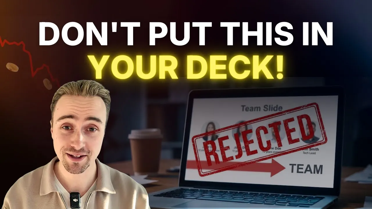
5. Team slide: the execution
Purpose: Prove that your team can execute this specific vision. The team slide is one of the most critical elements of a pitch deck because investors back founders first.
What investors evaluate: Founder experience, complementary skills, and whether the team has succeeded before. Did your co-founders build a $100M business together, or is this your first venture?
Investor psychology: "I'm betting on this founder. If I don't believe they can execute, it doesn't matter how good the idea is."
Mistakes to avoid: Inflating credentials. Padding the team with non-working advisors. Listing irrelevant experience (your VP Sales background in enterprise software means nothing if you're selling to consumers).
Design tips: High-quality headshots. Include: name, title, and 1-2 lines of relevant experience. For seed, focus on founder(s). For Series A, add CTO and VP Sales/Marketing. For Series B, show your full executive team with an org chart. Avoid: excessive detail, outdated photos, or trying to list every achievement.
6. Market size slide: the opportunity
Purpose: Show that there's a large, addressable market worth pursuing.
What investors evaluate: Whether your TAM is based on real data (not made up) and whether SAM/SOM show realistic ambition. A $100B TAM with a $10M SAM signals you're thinking carefully about your initial footprint.
Investor psychology: "This market needs to be big enough to return the fund. A $50M business is a success, but it won't move the needle on a $100M fund."
Mistakes to avoid: Claiming a $100B market when your realistic addressable market is $1B. Using outdated data. Showing only TAM without drilling into SAM/SOM (which matter more).
Design tips: Table or visual breakdown showing: TAM ($X billion, source), SAM ($Y billion, your realistic segment), SOM ($Z million, your 5-year target). Include sources. Gartner, Forrester, and SEC filings are credible. Avoid made-up numbers.
7. Competition slide: the positioning
Purpose: Show your unique positioning against existing competitors and future entrants.
What investors evaluate: Whether you understand your competitive landscape and whether your differentiation is defensible long-term. If you say you have no competitors, investors know you're either naive or hiding something. Competitive intelligence platforms help you build credible positioning.
Investor psychology: "What stops a well-funded competitor from crushing you? If I don't hear a good answer, I'm nervous about this investment."
Mistakes to avoid: Denying competitors exist. Positioning yourself against the wrong competitors (comparing your B2B tool to a B2C consumer app). Vague differentiation ("We're better" without explaining how or why).
Design tips: 2x2 matrix showing competitors mapped against your product on two key dimensions (e.g., Price vs. Speed, or Ease-of-Use vs. Advanced Features). Position yourself in the ideal corner. Alternatively, a simple table: Competitor | Feature A | Feature B | Feature C | Price. Checkmarks show where you win. This approach is clear and credible.
8. Business model slide: the revenue
Purpose: Explain how you make money and why customers will pay.
What investors evaluate: Whether your revenue model is defensible, repeatable, and aligned with customer value. SaaS metrics are predictable. One-time transaction fees are riskier.
Investor psychology: "I need to believe you can achieve unit economics that support a high-margin business."
Mistakes to avoid: Unclear pricing. Over-complicated models. Pricing that doesn't match customer value ("We charge $99/month but save customers $10K/month in efficiency").
Design tips: One sentence explaining your model: "We charge enterprise customers $50K annually for platform access, with a 2-year contract." Then key metrics: average deal size, typical customer lifetime value, and customer acquisition cost. If you have multiple revenue streams, show what percentage each contributes.
9. Financial projections slide: the path to profitability
Purpose: Show a realistic path to profitability and a capital-efficient business.
What investors evaluate: Whether your unit economics are sound, whether you can reach breakeven with this capital raise, and whether your assumptions are conservative or overly optimistic.
Investor psychology: "If I give you $2M, when will you need another raise? Will you be able to raise it based on the progress you make?"
Mistakes to avoid: 200% year-over-year growth assumptions (unrealistic). Hiding burn rate. Using public company metrics for a startup (enterprise software can't sustain 60% gross margin at your scale).
Design tips: 3-year revenue projection showing: monthly or quarterly breakdown. Add operating expense forecast and gross margin trend. Show the cash runway with this capital. If you hit your targets and raise Series B at Y1 exit, when will that capital run out? Investors need to know the timeline for the next raise. Include footnote with key assumptions: "Based on 30% monthly growth, average deal size of $15K, and CAC payback of 8 months."
10. Ask slide: the commitment
Purpose: Be crystal clear about how much capital you're raising and what it will fund.
What investors evaluate: Whether the amount is reasonable for your stage and whether you have a realistic plan to deploy it.
Investor psychology: "I need to know exactly what I'm committing to and what I'm getting for it."
Mistakes to avoid: Asking for a vague amount ("We're raising between $1M and $3M"). Over-asking for your stage (seed founders raising $10M) or under-asking (wasting investor time for a $100K round that could close in a week via angel investors).
Design tips: Simple slide: "We're raising $1.5M. Use of funds: 40% engineering and product, 30% sales and marketing, 20% operations, 10% contingency." Show the timeline: "Closing in Q2 2026. First capital deployment in July." Investors want clarity and confidence.
The visual design of your pitch deck: hierarchy, color, and typography
Once you've nailed your pitch deck structure and decided on the best pitch deck outline for your stage, visual design becomes critical. Investor psychology isn't just about what you say, it's about how it looks. A strong pitch deck outline means nothing if investors can't read your slides in 90 seconds.
Hierarchy starts with contrast. If your headline and body text are the same size, there's no hierarchy.
Make your headline 44-54pt
Body text 16-20pt
Use bold for key claims
Use italics for supporting evidence
This forces investor attention to what matters.
Color and contrast should align with your brand but prioritize readability. High contrast (dark text on light background, or light text on dark) makes text scannable in a 5-second glance.
Avoid color combinations like red and green, which are difficult for colorblind investors to distinguish.
Stick to 2-3 colors throughout the deck. Consistency builds credibility.
Typography matters more than most founders realize. Sans-serif fonts (Helvetica, Montserrat, Inter) feel modern and clean. Serif fonts (Georgia, Garamond) feel authoritative but can be hard to read on slides. Pick one sans-serif for headings and body text.
Limit to two fonts maximum.
Never use more than three font sizes (headline, body, caption).
Investors will trust a deck with clear, simple typography over a deck with seven different fonts.
Your pitch deck design should be invisible. If an investor remembers your deck because it was "so beautiful," that's good. If they remember it because it was "so confusing," that's death.
Common pitch deck mistakes that kill investor meetings
Over 200+ investor conversations, these eight mistakes appear again and again in pitch deck structure and presentation. Understanding the right pitch deck structure can help you avoid these costly errors.
Too much text: Investors scan, not read. More than five bullets per slide loses them. Apply the "one message per slide" rule: if you have to explain a slide verbally, it's too complex.
Unclear differentiation: "The Uber of X" or "AI-powered" without specifics. Be precise: "We're 60% faster than CompetitorX because of our proprietary algorithm and 45-day onboarding."
Hiding bad news: If you're not growing 20% month-over-month, don't pretend you are. Show what you're optimizing and why. "Our cohort retention is 95%" beats hiding stagnating growth.
Weak team slide: Listing titles without explaining why this team is uniquely qualified. "Sarah built payments infrastructure processing $50B" beats "Sarah was VP of Product at Stripe."
Unrealistic projections: 300% year-over-year growth for five years. Conservative projections you hit at 80% feel more credible than optimistic ones you miss at 20%.
Too many slides: Seed: 13 slides max. Series A: 20 max. Series B: 25 max. Beyond that, investors scroll past critical information.
Missing competitive context: Avoiding competitors signals naiveté or arrogance. Investors trust teams that understand the landscape and explain why they'll win.
No clear call to action: Close with "Thank you" and investors don't know next steps. Be explicit: "Can we schedule a follow-up call to dig into the unit economics?" Clarity drives momentum.
Pitch deck tools and templates: choosing the right platform
You can build a winning pitch deck in PowerPoint or Figma. The tool matters less than the clarity of your message. That said, each platform has trade-offs. For detailed comparisons and creative pitch deck examples, check Figma's design library, Microsoft PowerPoint's latest templates, and Pitch's investor-grade design library. These platforms provide templates and pitch deck examples ppt that demonstrate best practices in design and narrative flow.
Tool | Best For | Pros | Cons | Cost |
|---|---|---|---|---|
PowerPoint | Founders comfortable with templates | Familiar, deep template library, offline editing, easy distribution | Design defaults are dated, animation limitations, requires discipline for consistency | $70/year |
Keynote | Mac users who want design polish | Beautiful default templates, smooth animations, great typography, iCloud sync | Mac-only, smaller template library, exports less reliably to PDF | Free (Mac) |
Figma | Design-savvy founders or teams with designers | Infinite customization, real-time collaboration, pixel-perfect alignment, integrates with design systems | Steep learning curve, requires design taste, slower performance with large files | Free for basic, $15/month pro |
Pitch | Founders who want investor-grade templates | Beautiful templates designed by designers, analytics tracking (see when investors view), easy sharing, brand consistency | Limited customization, can feel generic, higher price point | $96/year |
Slidebean | Non-designers needing a complete solution | AI-powered layout suggestions, extensive template library, design reviews available, industry-specific templates | Requires subscription for full features, limited offline editing, brand lock-in | $120-$240/year |
Quick tool selection guide based on founder type:
First-time founder, no designer: Use Pitch, which offers investor-vetted templates with no design experience needed. The platform provides pitch deck examples in PowerPoint and other formats to get you started quickly
Design-savvy founder or has a designer: Use Figma for maximum flexibility and pixel-perfect control
Speed is the priority: PowerPoint, familiar, works offline, no learning curve
My recommendation: If you're a first-time founder without design experience, use Pitch. The templates are vetted by investors and provide creative pitch deck examples to guide your pitching outline. If you have a designer on your team or you're design-savvy, use Figma for maximum flexibility. If you're comfortable with templates and want the simplest path, PowerPoint works fine. Don't let tool selection paralyze you. The message matters more than the medium.
How to present your pitch deck: pacing, interruptions, and story arc?
A beautiful deck with a weak presentation kills the deal. Here's how to present with conviction.
Pacing: You have 10 minutes to present. That's 60 seconds per slide. Your pitching outline structure should allocate time strategically, spend 10 seconds on your title slide and opening, 60 seconds on traction and team, and 45 seconds on market size and business model. Practice with a timer. When you practice with urgency, you'll present with momentum, which reads as confidence.
Handling interruptions: Investors will interrupt. "Why did you choose this market?" or "How is this different from CompetitorX?" Answer in 30 seconds max. Your pitching outline should anticipate common questions, so you can address them smoothly.
Then say: "I'll go deeper on this in Slide 7 if you want, or we can keep exploring." This shows you're prepared and flexible.


Story arc:
Open with urgency (the problem matters)
Build momentum through traction and team
Show the financial opportunity
Close with conviction.
A flat monotone presentation (all slides get equal emphasis) feels exhausting. A presentation with peaks and valleys (urgent problem → breakthrough solution → proof of traction → team conviction → ask) feels alive.
Pauses matter: Don't narrate every bullet point. Let some slides speak for themselves.
A 10-second pause after showing a traction graph lets investors internalize what they're seeing.
Silence feels slow when you're nervous, but it signals confidence.
Structure first. Design last. Pitch with conviction. If you want expert feedback on your deck before your next investor meeting, our pitch deck design services can review your outline and positioning. Let the data do the talking.
Structure first, design last, pitch with conviction
The best pitch decks are boring in the best way: so clear, so well-structured, and so backed by data that investors forget they're looking at a presentation and start evaluating the business. That outcome doesn't come from design tools or templates; it comes from getting the outline right before anything else.
Start with your pitch deck structure. Get the message hierarchy right, cut every slide that doesn't justify its place, and rebuild the emphasis to match your funding stage. Design serves structure, not the reverse - a mediocre-looking deck with crystal-clear messaging beats a beautiful deck with a muddled story.
For more on investor communications, see our guides on investor updates and investor due diligence. If you want expert feedback before your next investor meeting, spectup's pitch deck advisory reviews outline, positioning, and narrative. Visit spectup to see the full range of founder advisory services.
Concise Recap: Key Insights
Stage-specific structure matters more than design
Seed decks need 13 slides, Series A needs 18-22, and Series B needs 20-28. Match your stage or investors will spot the mismatch in the first 2 minutes.
Traction is your strongest argument.
Revenue growth, customer retention, and partnerships are the only claims investors won't question. Team credentials and market projections can be debated. Lead with traction.
Avoid the eight fatal mistakes.
Too much text, unclear differentiation, unrealistic projections, and no clear ask kill investor meetings. Fix these eight mistakes to outperform 70% of founders.
Frequently Asked Questions
What should be included in a pitch deck outline?
A pitch deck outline should contain 10-20 slides covering problem, solution, market size, traction, team, business model, financials, and ask. Seed decks emphasize founder and product; Series A decks focus on growth metrics; Series B decks highlight scalability and unit economics. The exact slide order depends on your stage and what investors prioritize.