


Table of Content
Summary
Master the 10-slide structure investors expect
The canonical pitch deck framework solves the problem, proves the solution, and establishes market scale. Each slide serves a specific risk-reduction function.
[01]
Customize by stage to accelerate investor confidence
Pre-seed emphasizes founder-problem fit. Seed requires traction metrics. Series A demands financial rigor. Series B+ proves scalability. Stage determines emphasis, not just content.
[02]
Build a go-to-market slide that converts
Define ICP precisely, map 2-3 channels with CAC and LTV data, show payback period, connect unit economics to financial projections. Vague GTM kills deals.
[03]
Avoid the 7 pitch deck mistakes that cost funding
Inflated TAM, unclear problems, missing cohort data, vague asks, weak teams, no storytelling, and overdesigned slides each kill investor conversations. Specific fixes included.
[04]
Present with conviction and precision for results
1.5-2.5 minutes per slide, conversational pacing, specific metrics highlighted, scenes not summaries. Presentation quality converts investor meetings to next stage.
[05]
A founder walks into an investor meeting with an 18-slide deck they've sent to 40 VCs without customisation. No tailoring to the investor type or custom story.
The meeting lasts 12 minutes before the investor glances at their calendar. The founder never gets a callback.
This happens because founders treat pitch decks as compliance documents, something you check off before the real conversation happens. But here's the reality:
Investors evaluate your deck before they'll take the meeting. SaaStr's research on investor decision-making consistently shows that clarity drives investor interest far more than design polish.
Pitch decks aren't beautiful presentations. They're decision-making tools. The best decks don't try to convince; they clarify.
They answer the three questions every investor actually asks:
Is there a real problem worth solving?
Can this specific team solve it?
Is the market big enough to warrant the capital ask?
We've worked with over 150 founders at spectup across pre-seed through Series C rounds, and we've seen which deck strategies convert investor meetings into term sheets and which ones end conversations in the first 10 minutes. The difference isn't design polish. It's clarity, specificity, and stage-appropriate emphasis.
According to LivePlan's research on pitch deck best practices, founders who customize their decks for investor type and funding stage see measurably higher close rates.


What do investors actually look for in a pitch deck?
Start here: investors don't evaluate your deck against a fixed rubric. They pattern-match against hundreds of other decks they've reviewed.
The question isn't "Is this perfect?" It's "Does this reduce my risk of writing a bad check?"
If you want professional guidance on pitch deck design services, our team helps founders move past the common mistakes that sink investor meetings.
Your deck does three things in this order.
It establishes that a real problem exists, something that matters enough that founders will spend years solving it and customers will actually pay to solve it.
Not a nice-to-have. Not a feature improvement. A core problem that causes genuine business friction. Problem clarity is the foundation.
It proves your team can actually solve this particular problem.
Not problems in general; this problem.
What's your unfair advantage?
Why are you uniquely qualified?
It shows the market's large enough that solving it generates venture-scale returns.
A $50M market doesn't matter at a $10B valuation. A $10B market does.
That framework covers problem clarity, founder credibility, and market scale.
Hit all three and you convert investor meetings into capital. Miss one and investors will ask clarifying questions in the meeting instead of moving forward.
Clarifying questions slow down decision-making. Momentum dies.
A SaaS founder we worked with raised $7M ARR but buried the retention story in slide 11. Investors saw 18% month-over-month growth rate and assumed the business was healthy. But during diligence, the cohort waterfall revealed 76% gross revenue retention and churn concentrated in year-two cohorts.
Three investor conversations died once the analysis surfaced that problem. Lead with cohort data early. Investors need to see growth quality, not just speed.
That story repeats across every pitch we see: founders assume investors care most about growth rate. Investors care about growth quality. In 70% of decks we review, retention data appears after slide 8.
If you're growing fast but losing customers, you're not raising capital; you're haemorrhaging. Show retention first. Then talk about growth.
The 10-slide foundation and when to customize it:
The canonical 10-slide structure mirrors how investors think about risk reduction. It's the framework every founder should know by memory:
Slide | Purpose | Key Content |
|---|---|---|
1: Hook/Title | Introduce your company | Name, mission statement, one-sentence description. Clarity wins. |
2: Problem Statement | Paint the pain | Specific scenario where the problem matters. Show cost or pain viscerally. |
3: Solution | Prove it works | One clear statement + evidence: customer validation, usage data, or paying users. |
4: Market Opportunity | Justify the upside | TAM, SAM, SOM with math backing each figure. |
5: Product & Traction | Show real validation | Demo, screenshots, or usage metrics. Growth rate, customer count, revenue. |
6: Unit Economics | Prove sustainability | CAC, LTV, payback period, or gross margin. Show the business is repeatable. |
7: Go-to-Market | Prove acquisition works | ICP, channel strategy, acquisition math. This separates thorough founders. |
8: Competition | Show your advantage | Name competitors, explain differentiation. Arrogance (no competition) signals naivety. |
9: Team | Prove capability | Relevant experience only. Highlight gaps you're actively hiring to fill. |
10: Financials & Ask | Close the deal | 3-5 year projections, burn, runway, and precise raise amount. "We're raising $1.5M" beats "up to $2M, depending." |
This 10-slide structure is the minimum viable deck answering the fundamental question of what to include in a pitch deck. You can add slides for partnerships, regulatory moats, customer logos, or technical defensibility, but don't cut the core 10 without justifying why in the pitch meeting.
For more detailed guidance on sequencing your slides, see our detailed breakdown of pitch deck outlines and optimal slide sequencing, or check Figma's design resources for pitch deck structure examples.
Stage-specific pitch deck strategies: pre-seed through series C
Here's where most founders get it wrong: they use the same deck structure across every funding stage.
Pre-seed investors care about founder credibility and problem-solution fit.
Series A investors care about financial projections and scalability.
Series B investors care about market dominance.
Change your emphasis dramatically for each stage. This is what separates founders who raise quickly from those who don't. Our fundraising consultant expertise specializes in stage-specific positioning that accelerates investor confidence at every round.
Pre-Seed (Founder + Problem fit):
6-8 slides total. Lead with the founder's story:
Why are you uniquely qualified to solve this?
Investors are betting on founder quality here, not market validation.
Show you've talked to customers and that the problem is real.
Show product mockups or early prototypes.
Unit economics don't matter yet at pre-seed; founder judgement and problem understanding matter. This is the stage where a founder's pattern of success and failure history matters more than financial models. Learning how to structure a pitch deck for investors at pre-seed is straightforward.
Founder story (why you?)
Problem clarity (why this?)
Early user signals (do customers care?)
Ask for clarity (how much and why?).
That's enough.
Seed (Early traction): 10-12 slides. You now need quantified user adoption, revenue, or engagement metrics.
Show cohort data if SaaS
Show retention curves
Show unit economics with precision.
Slide 7 (go-to-market) becomes absolutely critical; investors need to see your customer acquisition strategy and the maths behind it.
Most founder mistakes happen at seed stage: vague TAM claims and missing cohort data. These two things kill seed rounds more than any other factor. We've seen founders with solid traction fail at seed because they couldn't articulate their TAM realistically or didn't have cohort analysis ready. Don't be that founder. Nail those two things before the meeting.
Series A (Product-market fit):
12-14 slides. Financial rigour matters now.
Show 3-year projections, realistic CAC and LTV calculations, and your path to profitability or $10M ARR.
Add a slide on your management team's operational experience.
Investors care about whether you can actually execute at scale, not just validate the market. They're asking, "Can this founder scale a company to $100M revenue?" At Series A, that's the fundamental question. Your financial model now needs to show how you get from current revenue to the stated projection, with specific assumptions about growth rate, CAC, and margin expansion. Hand-wavy financial models lose Series A rounds.
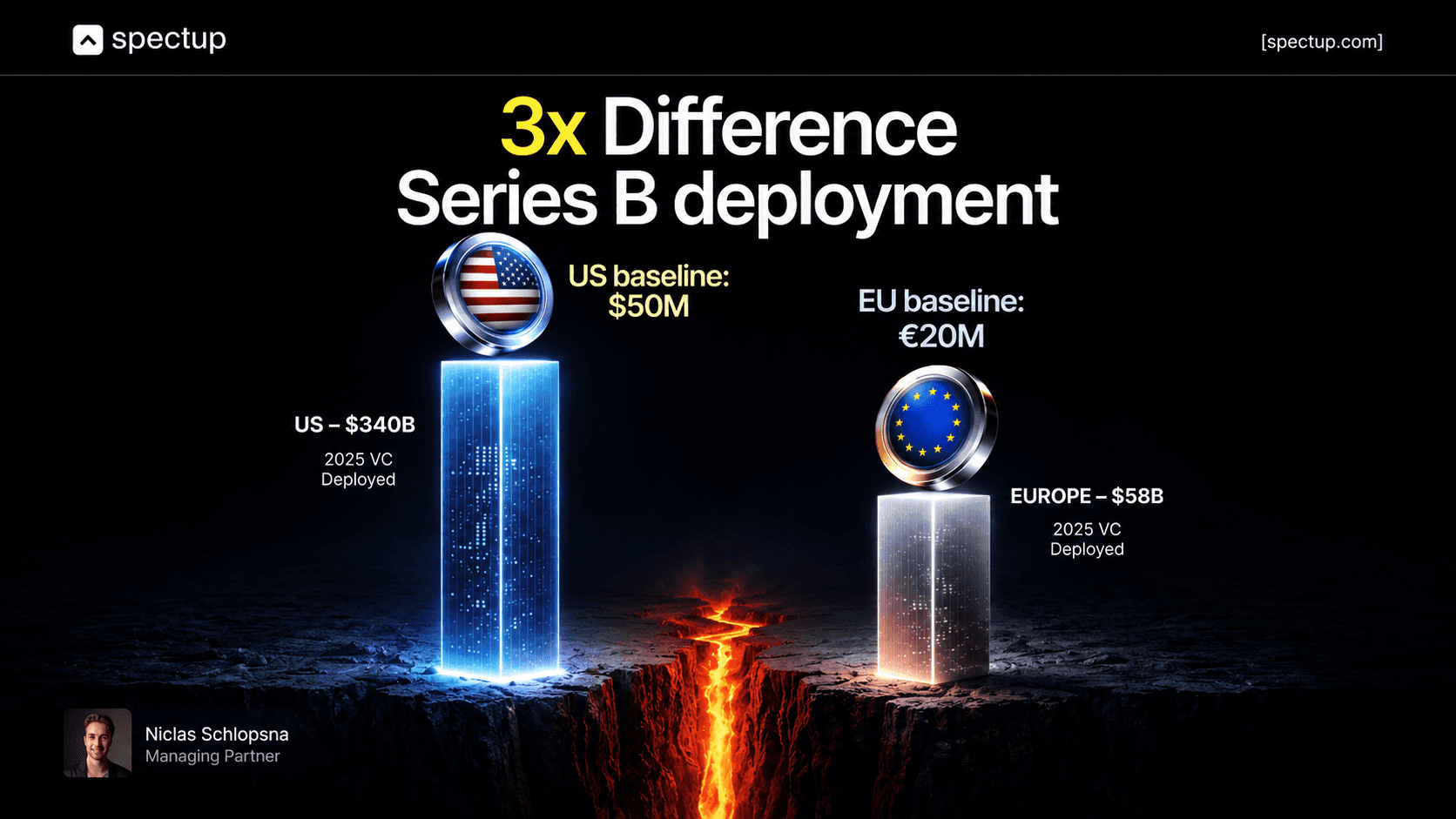
Series B+ (Market dominance):
15-20 slides. Unit economics are table stakes. Now investors want to see expansion strategy (how you move upmarket or add customer segments), competitive positioning in detail, margin expansion roadmap, and proof points (key customer references, partnership moats, and regulatory barriers).
You're competing against similar-stage companies, so differentiation slides and market position matter. This is where comparisons to competitors become table stakes. The pitch deck structure investors expect at Series B includes meticulous financial modelling and competitive analysis.
Show why you're winning
Quantify it, if possible
A Series B investor is evaluating not just whether you'll succeed, but whether you'll dominate your category.
The pattern: early stage is narrative-forward and founder-centric. Later stages are data-forward and operator-centric.
Early investors want to believe in you. Later investors want to see your financial model work and your operational team execute. Build different decks for different stages. In over 80% of funding rounds we've supported, stage-mismatched decks were cited as the primary rejection reason.
Don't try to build one deck that works for all four stages. It won't: over 60% of early-stage founders we see submit stage-mismatched decks to later-stage investors. Your pre-seed deck will bore Series A investors with a lack of metrics.
Your Series B deck will overwhelm pre-seed investors with financial complexity. Stage-appropriate emphasis is everything.


Crafting your go-to-market strategy slide (with specific examples)
This go-to-market strategy slide pitch deck is the slide that separates founders who've thought through customer acquisition in detail from those who haven't. Most founder pitches fail here because the go-to-market strategy slide pitch deck is where vague thinking becomes obvious. Once your deck is ready, learning how to send your pitch deck to investors with proper messaging and timing can dramatically improve response rates.
What is an ICP and why does it matter in your go-to-market slide? ICP = Ideal Customer Profile.
Who actually buys from you?
"Anyone who wants to..." isn't an ICP. "Early-stage B2B SaaS companies with 10-50 employees spending $5K+/month on operational tools" is an ICP.
Name the company profile
Describe the persona and the decision-maker
Be specific about company size, industry, and budget range
A strong go-to-market strategy pitch deck starts with ICP clarity. According to OpenVC's go-to-market slide research, founders who articulate a precise ICP versus a broad "total addressable market" approach see 40-60% higher investor confidence in their GTM credibility.
How should you structure your channel strategy on the go-to-market slide?
"We'll do inbound marketing" isn't a strategy. A solid marketing strategy pitch deck or go-to-market strategy pitch deck includes specificity. We'll reach 80% of our ICP through three channels:
(1) LinkedIn ads at $2.50 CPL with 15% conversion to trial
(2) Cold email outreach to warm intros at $200 CAC and 30% conversion to customer
(3) Integrations with accounting software platforms at $1,500 CAC and 50% LTV-to-CAC ratio
All of the above are considered strategies. That's specific. Investors will believe it or challenge it specifically. Research from StoryDoc on social media pitch decks shows that founders who enumerate channels with specific metrics see 3x more follow-up meetings than those who use vague channel descriptions.
Show the math explicitly on your go-to-market strategy slide pitch deck. CAC per channel. Blended CAC across all channels. LTV. Payback period.
If it takes 18 months to recoup a $3,000 CAC, that's sustainable for enterprise SaaS but impossible for consumer.
If you can't do the math on this slide, you'll get grilled in the meeting.
Better to get grilled in advance and fix it. Founder Institute's pitch deck resources provide templates for GTM math that pass investor scrutiny.
Connect GTM to financial projections. If your Series A projection assumes 200% YoY growth and your CAC payback is 24 months with a blended CAC of $2,000, you need $4.8M in new revenue to reach that growth while maintaining the same LTV-to-CAC ratio.
If your financial model assumes $6M in new revenue, you either need to reduce CAC by 25% or increase LTV. Pick one or both and show it. Investors will catch internal contradictions between your GTM slide and your financial projections. Figma's pitch deck examples demonstrate how successful founders tie GTM assumptions directly to revenue projections.
A founder we worked with cut a 22-slide deck to 11 slides at investor suggestion. Investor meeting conversion rate doubled. This is one of the best pitch deck examples for funding we've seen, sometimes less is more.
A healthtech founder cut a 32-slide deck to 13 slides focused on unit economics and market positioning. Result: booked 7 investor meetings in two weeks.
Another founder raised seed funding successfully with a consumer brand by splitting one 18-slide all-purpose deck into two versions: an 8-slide teaser deck for cold intros and conferences, and a 13-slide meeting deck for warm conversations. These best pitch deck examples for funding demonstrate that customization and clarity drive results.
The teaser deck got meetings fast; the meeting deck won trust. Density kills clarity. Precision converts.

Common pitch deck mistakes and how to fix them:
These seven mistakes appear across roughly 70% of the decks we review. Understanding effective pitch deck strategy means avoiding these pitfalls. Each one signals a specific knowledge gap to investors:
Inflated TAM with no bottom-up validation
Vague problem statement without customer specifics
Undetermined raise amount or weak capital plan
Missing cohort data for SaaS metrics
Generic team slide without track record
Misaligned storytelling for investor type
Overdesigned slides that obscure the message
Inflated TAM: "Our market is $100B globally, so even 1% is a $1B opportunity."
Investors have heard this pitch a thousand times. They don't believe it. Show realistic TAM and credible SAM. If your SAM is $2B, that's impressive. Don't oversell.

Unclear problem statement: "We help companies be more efficient."
What companies?
Efficient at what?
What's the cost?
Vague problems get vague solutions. Be specific. Paint a scene. "When founders are 6 months pre-fundraise, they spend 3-4 hours per week on investor research, relationship building, and deck iteration. That time is capital they can't spend on products. We reduce that to 1 hour per week. "That's specific. That's a problem.
Vague ask amount: "We're raising $1-2M, depending on interest." That's weak. Precision signals confidence. "We're raising $1.5M" is stronger. Investors respect founders who know exactly how much capital they need and why.
Missing cohort data (SaaS critical): A founder pitched with 12 slides but zero cohort data. Planned to explain customer acquisition payback verbally during meetings. The first investor immediately asked for the data before scheduling a follow-up meeting.
Show cohort waterfall, retention curves, and NRR in the deck itself. Don't plan to explain it away in conversation. Investors need to see it.
Weak team slide: List names, titles, and company history. If the co-founder worked at Google for 10 years, say which team and for how long. If they built something relevant, say it. "10 years at a top tech company" is less credible than "Built operational tools for a 500-person SaaS company, led a $2M GTM budget, and generated $8M in pipeline. "Specificity matters.
Misaligned storytelling: An enterprise company had $5M revenue and 40 enterprise customers, but the deck read like an earnings report. Metrics and data everywhere, but no narrative about why customers buy.
Investors saw data but not a reason to care. Add a customer success story.
Show why the market needs this.
Why does the problem matter enough that people pay for the solution?
Overdesigned slides: Fancy animations, gradients, custom fonts, and complex graphics distract from clarity. Whether you're building a social media deck or a traditional investor pitch, clean design, readable fonts (sans-serif for on-screen viewing), and consistent layouts work.
Design should support understanding, not fight it.
Investors reviewing decks on mobile (70% of initial reviews in 2026) can't see fancy designs anyway.
Design and mobile responsiveness: 2026 requirements
In 2026, over 70% of initial investor deck reviews happen on tablets or mobile phones. A slide that looks perfect on a 27-inch monitor can be unreadable on a 6-inch screen.
Your design choices directly impact whether investors will engage with your deck.
Keep slides text-light. If you're reading bullet points during a presentation, you've lost the battle. The deck should anchor the verbal story, not replace it. Target 3-4 lines of maximum text per slide.
Use visual hierarchy. Headline: Largest. Subheading medium. Supporting text is small. Use whitespace to separate ideas. A slide with breathing room reads like clarity.
Choose one consistent colour palette across all slides. A dark background with light text is readable on mobile. A light background with dark text is readable on projectors. Test both before sending.
Keep data visualisations simple. If showing growth, use a line chart. For composition, use a bar chart or pie chart. Avoid 3D charts or unnecessary complexity. On mobile, complex charts become illegible.
Test your PDF on mobile before sending. Open it on an iPad and iPhone in portrait and landscape mode. If you can't read it, investors can't either. This is non-negotiable in 2026.
Mobile-first design is no longer optional. Investors review decks on phones between meetings. Visible's analysis of investor workflows confirms that decks reviewed on mobile see meaningfully different engagement patterns than those reviewed on desktop.


Presenting your deck: delivery strategies that convert
The deck is half the battle. Presentation is the other half. A perfect deck with a weak presentation won't convert. A solid deck with strong presentation almost always converts. Most founders focus on building the deck and neglect the delivery, which is backwards.
Practise delivery with as much rigour as you build the slides. Spend equal time practising the pitch out loud.
Allocate 1.5-2.5 minutes per slide in a 10-slide deck.
That's 15-25 minutes of total presentation time, leaving room for investor questions.
Most founders either rush (10 minutes) or drag (35 minutes).
Optimal pace feels conversational, not mechanical.
Open strong within 60 seconds
Lead with the problem or a founder story, not "Thanks for taking the meeting." Get to the insight immediately. A strong opening hooks investors instantly.
Pause between sections.
After the problem, pause. After the solution, pause. The best pitches are conversations, not monologues. Investors who are engaged ask questions. If you're not getting questions, you're not connecting.
Emphasise the numbers that matter.
If your NRR is 110%, call it out: "Our NRR is 110%, which means expansion revenue is beating churn every month. That's the number that matters." Make it easy for investors to spot the metrics signaling business health.
Tell scenes, not summaries.
Specific, concrete details stick in investor memory; vague summaries blur. A scene with characters, moments, and outcomes beats generic examples.
Close with the ask and next steps.
Don't end with "Questions?" End with clarity: "We're raising $1.5M and we're looking for investors who've backed similar-stage B2B SaaS companies.
If this resonates, I'd like to grab 30 minutes next week to discuss our customer acquisition strategy." That's actionable.
If an investor questions a slide during the presentation, don't get defensive.
Say "Fair question" and answer directly.
If you don't know the answer, say "I don't have that number with me, but I'll send that data by EOD tomorrow."
Confidence and honesty matter more than perfect answers. Investors trust founders who admit what they don't know more than those who bluff. A direct "I don't know" followed by a commitment to send data actually builds trust. Building genuine relationships with investors through warm introductions is often more effective than mass outreach, as it sets a collaborative tone from the first conversation.
If an investor tries to derail you with a question about something you were planning to cover 3 slides later, answer briefly, then say "That's a great point. We're actually going to dig into this more in a couple slides. Let me get there and then we can go deeper."
That keeps your narrative momentum while respecting the investor's question. It shows you've practiced and you understand the flow of your pitch. Strong execution during the presentation is what converts investor interest into committed capital.
Your next move: Build the deck that gets meetings
The founders who raise funds fastest aren't the ones with the most polished slides; they're the ones who understand exactly what investors are evaluating at each stage and structure their narrative around those priorities. Stage-appropriate design, ruthless editing, and data-backed claims get you meetings. Presentation discipline converts those meetings into term sheets.
Start with the 10-slide skeleton, rebuild the emphasis for your funding stage, and eliminate every slide that doesn't answer an investor question. If a slide doesn't justify its place in under 30 seconds, cut it. The decks that raise capital don't try to be comprehensive; they're surgical.
If you want a second opinion on your deck's structure before the next investor conversation, spectup's pitch deck advisory has reviewed 150+ decks across every stage. We know what kills deals before the first meeting, and we know what gets founders into rooms where capital is actually committed.
Concise Recap: Key Insights
Stage determines structure, not vice versa.
Pre-seed emphasizes founder credibility; seed requires traction metrics; Series A demands financial rigor; Series B+ proves market dominance. Use the same 10-slide skeleton but rebuild emphasis completely for each stage.
Go-to-market clarity converts investor confidence into capital.
Define ICP precisely, map channels with exact CAC and LTV data, show payback period, connect to financial projections. Vague GTM slides kill deals. Specific data-backed slides accelerate fundraising.
Density kills clarity; precision converts.
Cut slides that don't reduce investor risk. Ten slides beats twenty. Specific ask amounts and clean storytelling signal founder maturity.
Frequently Asked Questions
How many slides should a pitch deck have?
The canonical structure is 10-12 slides for seed and Series A; pre-seed typically works with 8-10, and Series B+ may expand to 15-20 with financial depth. Avoid decks over 20 slides: investor review time averages 2:24 per deck, and density kills clarity. If you're explaining a slide during a meeting, cut it or simplify the message.

